Inward investment into the West Midlands 2009/10 – a local analysis

In 2009/10 there were 84 inward investment successes in the West Midlands and another four knowledge-based investments. These investments created over 1,500 new jobs and safeguarded another 4,300.

Although these 88 investments represented the lowest number of jobs created or safeguarded since 1992/93, they also represented the 7th highest total number of projects since 1991.

Pie chart shows 38 inward investments in West Midlands metropolitan areas and 49 inward investments in the shire counties over 2009 to 2010Inward investment is usually spread reasonably evenly between the West Midlands metropolitan areas and the shire counties. In 2009/10 the shire counties attracted the majority of inward investment projects (55%). See left.

However, the metropolitan areas of Birmingham, Coventry, Solihull, Dudley, Sandwell, Walsall and Wolverhampton have attracted perhaps just over half of the projects over the years – see below. The number of jobs created and safeguarded also generally follows a similar pattern.

Stacked bar chart shows percentage of inward investments into West Midlands metropolitan areas versus shire counties between 1991 and 2010

Continue reading

Interactive maps – beyond election results

Media coverage of yesterday’s general elections has included many interactive online maps. Voters have been able to explore the election votes in different ways, seeing who won what where, and how close the contests were.

Here at the Observatory, we use InstantAtlas software to produce this kind of map. We’ve produced a map of yesterday’s election results as an example, but in fact we have many other maps available covering a wide range of topics. For example, Jobseeker’s Allowance claims by ward or the results of the place survey, which asked residents how they felt about their local government.

Looking at these kinds of data geographically can often be illuminating; maps can often reveal patterns that the raw data alone wouldn’t reveal. At the Observatory, the spatial dimension is something we’re always considering – maps aren’t just for election time!

New report sheds more light on West Midlands geography

In the public sector, many of our policies, strategies and services follow administrative boundaries such as regions, local authorities, police force areas, primary care trusts or even wards.

But out there in the real world, people don’t live their lives as neatly as that. Many people live in one place and work, learn or shop in others. Businesses too have customers and suppliers from many different places.

Whilst every person, and every business is different, understanding the patterns in these kinds of links between places is important.

For example, when analysing the local labour market it is no good just looking at the people who live locally if many local workers come from elsewhere.

Understanding “functional geographies” has always been important but the issue’s profile has been raised in recent times as government has sought to devolve more responsibility for economic development to sub-regional and local areas.

Over the next year all upper tier and unitary local authorities will need to produce Local Economic Assessments. Government guidance says that these will need to “identify the economic linkages within the area assessed and between it and the wider economy.”

In preparation for this, the Observatory has just published a report looking at some of the key sub-regional links between places in the West Midlands.

Continue reading

Observatory map featured in top 10 government data visualisations and applications

An interactive map produced by the Observatory has been featured in The Guardian’s top 10 government data visualisations and applications.

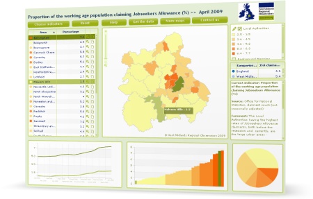
Screenshot: interactive map showing Jobseeker's Allowance claimant rates in the West Midlands

This map shows the proportion of the working age population claiming Jobseeker’s Allowance in each local authority in the West Midlands. You can also compare data for each local authority with the West Midlands and UK averages.

The map is based on the latest employment and unemployment data released monthly by the Office for National Statistics. The Observatory analyses this data as part of its work in monitoring the impact of the recession on the West Midlands.

As well as local authority, we also show the data in maps for:

The 10 data visualisations and applications were highlighted by the Guardian Datastore on the same day the government publicly launched the data.gov.uk site. This new site aims to unlock innovation and encourage data-led decisions by opening up public sector data for reuse in innovative applications and websites.

Continue reading

Making the invisible visible: matching West Midlands ICT SMEs with business opportunities

West Midlands ICT Cluster AWMistThis is a guest post written by Brian Prangle with contributions from Andrew Mackenzie.

West Midlands Regional Development Agency, Advantage West  Midlands (AWM) has unveiled its latest initiative to stimulate and develop the high technology sector.

AWMist (A Web Map-based Information Search Tool) is the first regional interface of its kind where collaboration, business opportunity building, and partnerships can be easily forged between the region’s ICT SMEs (Small to Medium Enterprises) and those who can support and assist them, such as funding agencies, universities and business support projects.

Continue reading

Large variation in West Midlanders’ satisfaction with local theatres and concert halls

According to the first ever Department for Communities and Local Government (CLG) Place Survey results, the proportion of West Midlands residents satisfied with theatres and concert halls is the most variable indicator across the region, ranging from 76% in Malvern Hills to a low of 18% in North Warwickshire.

However, overall satisfaction with theatres and concert halls in the region (45%) exceeded the national average (43%).

In addition, compared to all other regions, West Midlands residents were the least satisfied with local sport and leisure facilities.

These two results, which carry implications for some of the region’s local cultural service providers, were highlighted as headline findings by colleagues at the West Midlands Regional Observatory as part of their detailed Place Survey 2008 analysis.

Continue reading

Interactive maps help monitor recession geospatially

We’ve produced a set of interactive maps to monitor the impact of the recession at different geographical levels in the West Midlands:

  • By West Midlands Local Authority
  • By West Midlands Census ward
  • Neighbourhoods in the Rural Regeneration Zone

The maps show Jobseeker’s Allowance (JSA) claimant rates (the proportion of the working age population claiming JSA), which gives an indication of unemployment.  The maps help us to see how the recession is affecting different areas.

Continue reading

Government ensures free access to some Ordnance Survey maps

Gordon Brown, Liam Byrne and Sir Tim Berners-Lee at the Smarter Government seminar at Downing Street, 17th November 2009

Gordon Brown, Liam Byrne and Sir Tim Berners-Lee at the Smarter Government seminar at Downing Street, 17th November 2009

Photo of Smarter Government seminar by Downing Street

Some Ordnance Survey maps are to be made available to businesses and the public, as part of the Government’s drive to open up data to improve transparency.

Speaking at a seminar yesterday on Smarter Government in Downing Street, attended by Sir Tim Berners-Lee and Professor Nigel Shadbolt, the Prime Minister and Communities Secretary John Denham set out how the Government and Ordnance Survey, Great Britain’s national mapping agency, will open up its data relating to electoral and local authority boundaries, postcode areas and mid scale mapping information.

This data would be released for free re-use, including commercially.

Continue reading

Observatory featured in new Analysis of Place newsletter

Spatial Analysis UnitWe’re featured in the first issue of the Analysis of Place newsletter (pdf, 1.89mb), published quarterly by the Spatial Analysis Unit (SpAU) in Communities and Local Government.

The Spatial Analysis Unit is a multi-disciplinary unit of geographers, economists, statisticians and social reasearchers, and sits within the Analytical Services Directorate. One of the aims of this unit is to promote spatial analysis in government.

Continue reading

Improving data visualisation for the public sector

Screenshot of home page of improving-visualisation.org

A new resource to help public sector researchers improve the way they visualise data has recently been launched.

DataViz, at www.improving-visualisation.org, is a new website launched by OCSI containing a gallery of visualisation types (which you can browse by tag).

There are also useful case studies on what makes for good visualisation, practical steps for improving visualisation and a review of online visualisation tools.

Continue reading

Place Survey results 2008

Logo of Department for Communities and Local GovernmentThe results of the Place Survey 2008 have recently been released.

This is a national survey administered by local authorities. It aims to collect consistent national data on the way people feel about their local area and the way in which their local authority is run.

We can use the results of the place survey to compare the West Midlands region as a whole to other English regions, and to compare local authorities within the West Midlands to one another.

Continue reading

Plot data on world maps with new OECD tools

Organisation for Economic Co-operation and DevelopmentTwo new online tools from the Organisation for Economic Co-operation and Development (OECD) now allow you to plot a huge array of social and economic data onto world maps and track them through time creating an animated chart as you follow your chosen geographic area against other areas. It’s easy to use and, more importantly, easy on the eye.

The first tool, the OECD Factbook eXplorer, allows you to display data (subject to availability) for countries from 1950 to 2006, or even beyond if forecast data is available.

Continue reading

Crowdsourcing policy, visualising debate and evolving consultation

LocalGovCamp an unconference for local governmentI attended a session on crowdsourcing public policy at the recent LocalGovCamp event, an unconference for local government held in Birmingham.

Crowdsourcing is the act of taking a task traditionally performed by employees or contractors and opening it out to a large group of people. It’s mass collaboration to collectively achieve a task or refine something that already exists into something better.

David Price led an interesting session on crowdsourcing policy, demonstrating how Debategraph—a global debate map—can be used to:

  • Set up a policy debate
  • Open the debate to enable others to collaborate
  • Graphically visualise the issues and inter-relationships within a debate
  • Share and re-use the debates both on and offline

Continue reading

Breaking out of the silo – a case study

Improvement and Development Agency logoThe West Midlands Regional Observatory is an excellent example of cross-organisation and cross-departmental working, according to a recent case study by the Improvement & Development Agency (I&DeA).

According to the study, the Observatory is a rich resource providing information, knowledge and expertise to a range of audiences.

Continue reading

Making the right choices in a disaster

INTAMAP map showing measurements of Nitrogen dioxide across the UK

Example INTAMAP interpolation (centre) of Nitrogen dioxide measurements across the UK

If there were a nuclear accident in Europe, how would those responsible for disaster response know where to focus attention? And how would they access the right information to make fast and accurate decisions?

Aston University are collaborating with eight other European partners to deliver the Interoperability and Automated Mapping Project (INTAMAP), which will provide emergency response decision makers with the complex data and information they need over the internet in a usable format… fast.

So, in the case of a nuclear accident, for example, they could use INTAMAP to make the right decisions quickly.

Continue reading